2022
None
Product / UI design / UX collaboration
UI Designer

Why redesign
After my initial frustration from
using ccb mobile app, the first
step I took was conducting
research and collect information
about the user experience and
identifying the problems.
Redesign of CCB mobile banking app with the core objective of improving process efficiency in the banking system, providing solutions to users’ pain points, and making navigation within the app more friendly.
01
Deliver easy to use and convenient user interface.
02
Propose a more intuitive and engaging experience so that users are comfortable accessing their money.
01
Take full ownership of the various roles involved in designing a product. Such as a user research, user experience designer and user interface designer.
02
Enhancing my learning experience by challenging some design decisions and addressing their solutions.
CCB is a commercial bank in Bulgaria that has quite a number of competitors trying to be better with their products, sales, and marketing strategies. I researched their competitor’s weaknesses and strengths, and also compared features on each bank app to identify opportunities for CCB mobile banking app. I also simplified the navigation process to bring a more smooth user experience.

Since I am already a user of this app. I decided to do an in depth, analysis of the app. Through the analysis, I was able to identify some clear usability issues and pain points.

I started my user research by conducting user interviews with 5 users, which vary from daily active users to infrequent users of any banking app to understand what motivates or demotivates them from using banking mobile app.
The male interviewees’ age ranged from 20 to 30 years old, while females ranged from 20 to 47 years old, which I felt was a fair representative sample of CCB current user base.
01
Almost all the participants use the banking app only for checking their available money.
02
Some of them occasionally use it for transfer money to somebody else.
03
All of them find it more convenient than going to the bank.
04
80% of the participants thinks that online banking is the future of banking.
To understand users’ pain points with the banking app, I needed to understand their perspective. I went through some reviews on the Play Store.

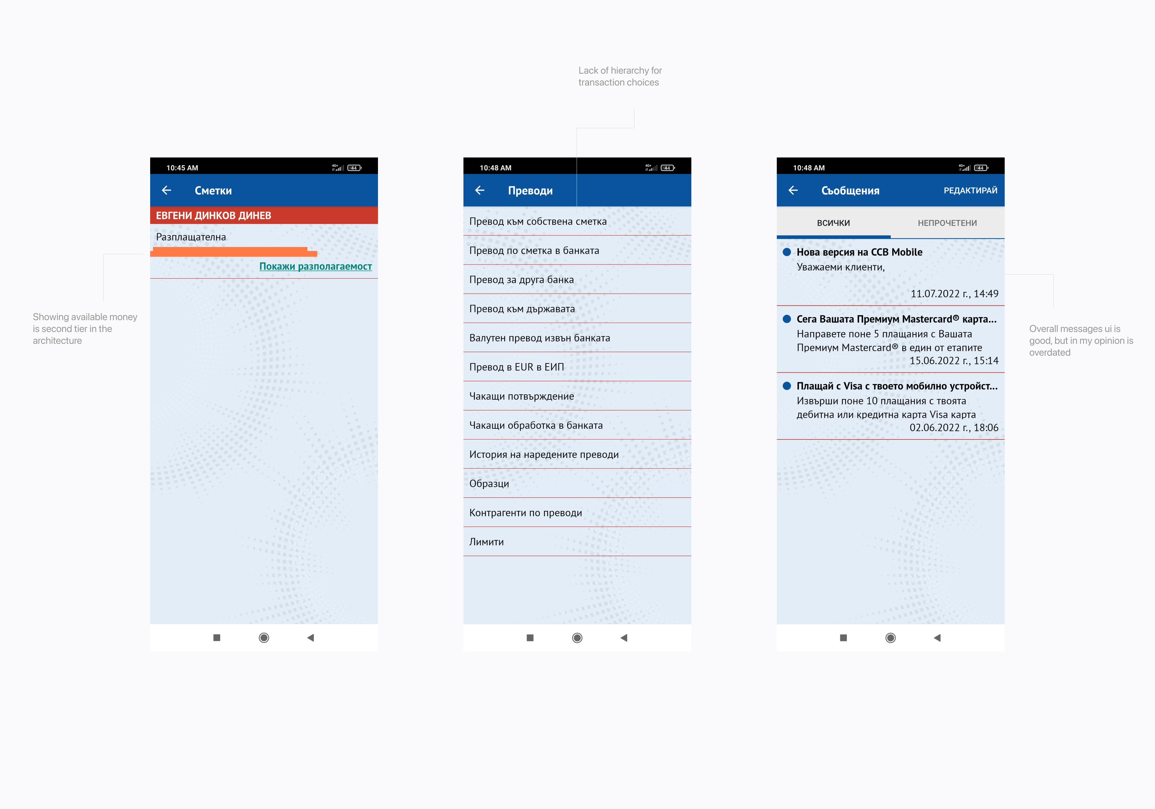
After identifying and analyzing pain points through user research, I defined the following pain point that most users had trouble with.
01
Login screen doesnt have
fingerprint or easier flow
for pin code
02
Home page has too
much options to
choose
03
Overall feeling of the UI
is outdated and clutter
04
Transfer money process
is clutter
Using the collected data from the targeted users. I created a user personas.

After the initial research and competitive analysis I decided to visualize the user experience that an average user will go through in order to accomplish a goal.

I compiled all the feedback, insights, and pain points listed above and grouped similar ones. This helped me brainstorm and develop potential ideas and gave a clearer view of what was important to users while keeping in mind the business goals and objectives.
I built a realistic representation of the app and then tested specific UI components and interactions, to understand the look and feel of the app.


To validate my app, I surveyed 7 people . I gave them around 5 tasks to test the redesigns performance and usability.
I tried to focus on features related to solving some of the major desired outcomes found in the initial research.


